
Schlitz ad- They are trying to advertise their new soft top cans which were easier to open than the cans of the time. They do this by showing comparing images.
The text is serifed in the ad, but not the product. The text seems to be heavy, on the bold side. X-height is on the high side, because the lower case letters seem to be slightly more than half of the capital ones. The letters are about the same width throughout, except on some letters, the bottom is different width from the top. Another exception is in the letter "y"which is much thinner on the right than the left. This text helps sell the product effectively. It is a bold, classic text. It gives a sense of this bold new idea of can, and the same old company that you have always loved.
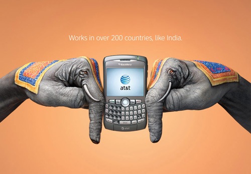
AT&T Ad- They use the imagery of the painted hands, in the shape of elephants, to sell their coverage in many countries, specifically India. The text is not serifed. The weight of the text is light, and the letters are thin. The x-height is high, because the lower case letters are more than half of the upper case letters. The text seems to be the same width throughout, without any noticeable exceptions. The text helps sell the product well. It gives you the information you need, but it doesnt draw your attention from the artwork, which is quite incredible.

Patton ad- This ad is trying to sell a patriotic movie, based on the actions of a controversial, yet great war hero. The text in the ad is serifed, and it is very bold in the main text. The subtext is not as bold, but still bolded. The text is all capital letters, so x-height is non-existent. Their is a strong contrast in thickness in some letters, such as "N" and "A." The text does a good job selling the movie, because it seems like a military type text, and the movie is about WWII


No comments:
Post a Comment